Color Harmony
Color Harmony represents a satisfying balance, pleasing arrangement and unity of colors and color relationships. Color harmony creates an inner sense of order and balance in the visual experience.
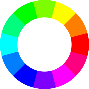
The color wheel is the basic tool for combining colors.
Primary Colors: Red, Yellow and Blue. All other colors are derived from these hues.
Secondary Colors: Green, Orange, and Purple. These are the colors formed by mixing the primary colors
Tertiary Colors: Yellow-orange, red-orange, red-purple, blue-purple, blue-green and yellow-green. These are the colors formed by mixing a primary and a secondary color.
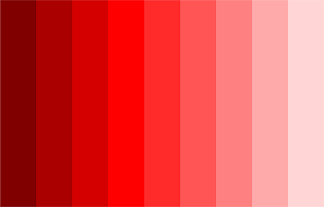
Tints, tones and shades within the same color family are used to create harmony.
Analogous color schemes use colors that are next to each other on the color wheel. They usually match well to create serene and comfortable ambience. When choosing, pick one color to dominate, a second to support. The third color is used as an accent.
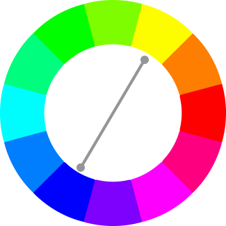
Complementary color schemes use colors that are opposite to each other on the color wheel. The opposing colors create maximum contrast and stability. The high contrast of complementary colors creates a vibrant look. This color scheme is tricky to use in large doses, but will work when you want something to stand out.
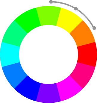
A split-complementary color arrangement results from one color paired with two colors on either side of the original color’s direct complement creating a scheme containing three colors.

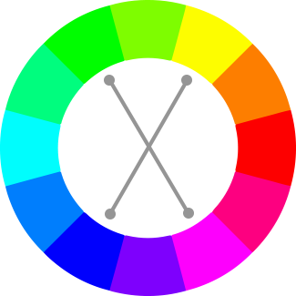
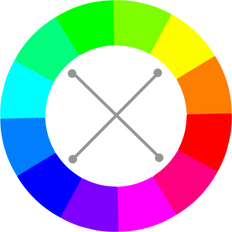
This color harmony includes two sets of complementary colors that sit next to and across from each other on the color wheel forming an X.
Tetrad combinations are made up of four hues equal distance from one another, forming a square or rectangle on the color wheel.
Diad combinations are made of two colors located two steps apart on the color wheel, skipping the color in between.

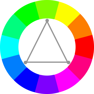
Triad colors are three colors equally spaced from one another, creating an equilateral triangle on the color wheel
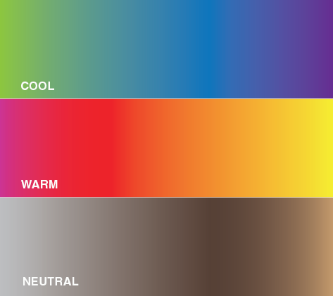
Cool colors: Colors such as blue, green and light purple have the ability to calm and soothe. Cool colors remind us of water and sky. Cool colors look as though they move away, making them great for small rooms you want to look and feel larger. If you have tiny bedroom or powder room that you want to visually enlarge try painting a color such as light blue to make it look more spacious.
Warm colors: Colors such as orange, red, yellow tend to make you think of sunlight and heat. Warm colors look as though they come closer, which is why they're often used to make large rooms look cozier. If you have a huge bedroom that you want to look more intimate try painting a warm color such as terra cotta or brown to make it feel cozier.
Neutral Colors: Neutral usually means without color. Soft hues, such as beige, khaki, and rain-cloud gray, create a calming atmosphere, while the contrast of a black-and-white color scheme introduces drama and flair.
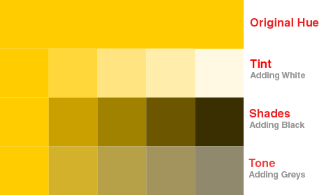
If a color is made lighter by adding white, the result is called a tint
If a color is made darker by adding black, the result is called a shade
If gray is added to a color the result is a different tone